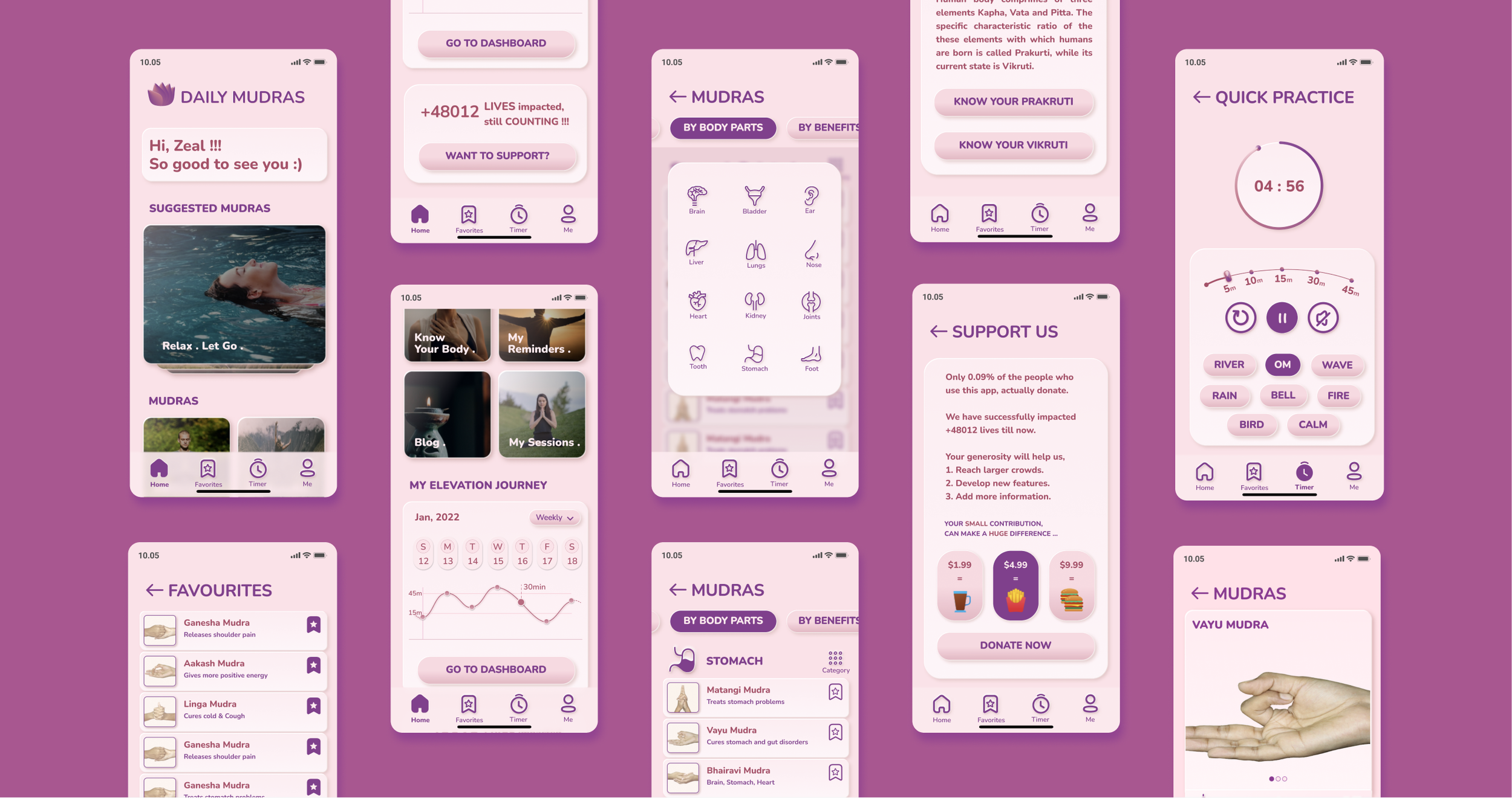
Yoga App Redesign
PASSION PROJECT
Creating a delightful experience
CHAPTER 0: PROJECT OVERVIEW
My Role: UX Researcher, UX/UI Designer, Team: Me & User Participants
Duration: 6 weeks (Jan2021 - Feb 2021)
Contribution: UX Research, UX/UI Design, LoFi Design Iterations, Usability Test, HiFi Prototype
This is a personal project. ‘Daily Mudras’ is a yoga app that assists in performing exercises to improve your physical and mental health.
What I did?
Based on the my research insights, I redesigned,
Visual Aesthetics 🔗 of the app to make it look and feel more rejuvenating.
Home Page 🔗 to help users navigate app content intuitively.
Donation Page 🔗 to increase the donation rate.
Exercise Assistance Page 🔗 to help users follow exercises accurately.
Original Yoga App Design
My Redesigned Yoga App
Investigating Problems with App
CHAPTER 1: RESEARCH
To understand user needs and frustrations while using the yoga app I conducted primary and secondary research (including 3 user interviews, competitive research with 5 workout apps)
Interview highlights
Key Insights
1. Users mostly use app to perform same set of exercises daily.
2. Users find it difficult to follow exercise accurately.
3. Users can’t find relevant exercises easily.
Problem of Focus
CHAPTER 2: PROBLEM DISCOVERY
“How might we help users find relevant exercise information and follow exercise instructions accurately?”
CHAPTER 3: DESIGN ITERATIONS
Design, Test, Iterate
Below are my Homepage Wireframe iterations
CHAPTER 4: FINAL SOLUTION
Improving User Experience
After multiple design iterations and user feedback, I designed the Hi-Fidelity Prototype for Daily Mudras App Redesign. The design meets the required accessibility standards as per WCAG 2.1🔗
Key Features
1. Redesigned Main Page for to navigate content intuitively.
Old (Click to Enlarge)
New
2. Redesigned Donation Page to increase user donation rate.
Old (Click to Enlarge)
New
3. Redesign Exercise Assistance page to make improve usability.
Old (Click to Enlarge)
New
Redesigned App Flow
Click on image to enlarge
Designed to Feel Rejuvenated
CHAPTER 5: VISUAL ELEMENTS
I designed various visual elements to make the brand feel more rejuvenating and approachable.
1. SplashScreen on loading app
2. Design Style Guides
3. Visual Aesthetics Implementation
What I learned
CHAPTER 6: KEY TAKEAWAYS
1. Leveraging predictability
Users want to avoid mundane steps and expect shortcut action paths for their repeated behavior.
2. Designing for Mobile
Human interaction with mobile is quite different from desktop with respect to input gestures, screen real estate and context of use. Learnt designing for mobile.
“In retrospective“
In addition to carrying out user research for app, I would also understand how the in-person yoga studios and other workout studios work, what are the loopholes of the online experience and how they can be filled.
If I had more time …
PARTING THOUGHTS
Hi! Thank you for scrolling till here🙏.
“If I had more time“
I would explore how different solutions based on augmented reality and body tracking, in addition to voice assistance, can help improve the user experience.


