Instacart Website Redesign
PASSION PROJECT
My Role: UX Researcher, UX/UI Designer
Team: Me, User Participants (for Field Research & Usability testing)
Duration: 6 weeks (Jan2021 - Feb 2021)
Contribution: UX Research, UX/UI Design, Wireframes, Usability Test, HiFi Prototype
Making Online Shopping Easier
CHAPTER 0: PROJECT OVERVIEW
Instacart is an American grocery delivery and pick-up service🥕🥑🥦 in the USA and Canada.
Why this project?
This is a personal project. During the pandemic the online ordering behavior increased 🔗 drastically. Instacart tried to capitalize the opportunity with new delivery models and ad campaigns. But when I used website, I found it exhausting. This inspired me to carry out a full-blown research about the problem.
The Problem
How might we help users shop on the Instacart website faster and intuitively?
The Solution
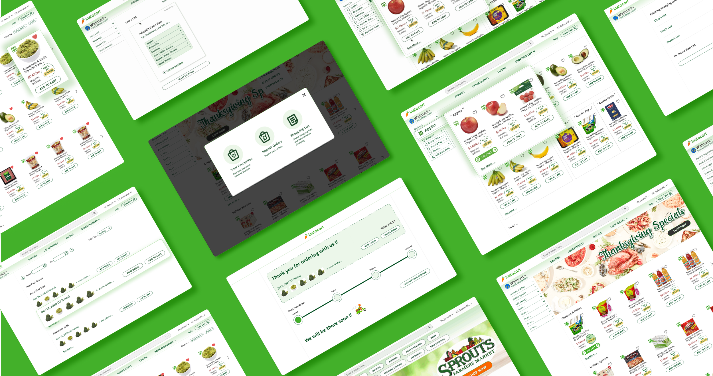
I investigated user needs and frustrations while shopping groceries online on Instacart website. Based on the insights, I designed the product browsing page layout🔗 to intuitively search items through navigation and ‘ShopSmart‘ feature🔗 using AI-based predictions to help users shop faster and efficiently with least friction.
The Impact
When Instacart launched website’s new version 10 months later (in Jan 2022), I was super-happy😁😁 to see it had implemented some features similar to my design🔗 like ‘Optimized Search‘, ’Shopping List’ etc. This definitely validates my research, solution value proposition and design process.
Instacart Original Website (Jan 2021)
My Redesigned Instacart Website
Understanding User Needs
CHAPTER 1: RESEARCH
To understand user needs & frustrations while ordering groceries online on the Instacart website, I conducted primary and secondary research (including 5 user interviews, 3 user field research, 7+ apps competitive product audits).
Interview highlights
“There are too many options. I am confused where to apply offers.”
User 1: 32, Software Engineer, Married (1kid)
“Ordering online is great for me to save time. Web is a complete mess. Mobile app is much better.”
User 2: 35, Male, Startup Lead, Married (No kids)
“Its difficult to find items. Prices are too high. I use amazon or costco. ”
User 3: 25, Recent Joinee at Finance Company, Single (No kids)
“I want to be over-conscious in the times of COVID, so I order online. I wonder if I could get over-the-counter food too. ”
User 4: 60, Medical Coder at Hospital, Married (No kids)
User Journey Maps
Key Learnings from Research
Based on the research insights, I found the current state of Instacart website product browsing page is confusing and non-intuitive. I focused on designing solutions for below problem hotspots to create maximum impact.
1. Users found website layout confusing
2. Users couldn’t find required items easily.
3. Lack of trust and price transparency on website.
4. Users were hesitate to buy fresh produce online as they were not sure of quality.
CHAPTER 2: PROBLEM
Problem of Focus
“How might we redesign the website to help users find needed items easily and make ordering process faster?”
CHAPTER 3: PROCESS
Design Iterations
Ideation Sketching
Click to enlarge
Wireframes
Usability Test & Insights
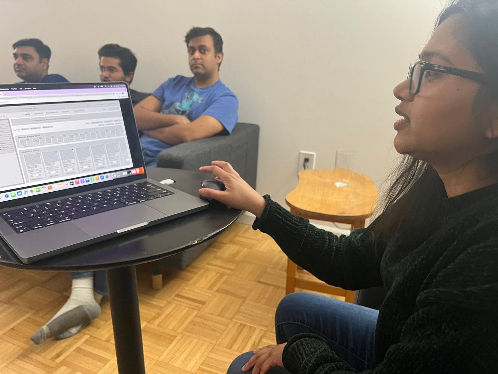
I conducted A/B usability test with 6 participants.
Key Insights
1. ‘Shop by Cuisine’ & ‘Optimized Search’ was found useful.
2. ‘Savings’ Page is the most visited page.
3. Two columns for shopping list was found confusing.
Based on the user feedback below design options were selected,
Shop by Cuisine
Shop by Recipe
Item Card Option A
Item Card Option B
Improving User Experience
CHAPTER 4: FINAL SOLUTION
After multiple design iterations and user feedback, I designed the final solution for the product browsing page layout and ‘ShopSmart‘ feature to improve user journey. Figma Hi-Fi Prototype 🔗
Key Features
1. Made item-finding intuitive with redesigned site navigation.
New Design
Old Design (Click to Enlarge)
2. Improved accessibility by redesigning item card.
New Design
Old Design (Click to Enlarge)
3. Optimized Item Search
4. Sped shopping process by designing New ‘Shop Smart‘ feature.
Impact
On user testing the Hi-Fidelity prototype with 6 users, I found,
75%↓
average decrease in time to find items (120sec → 30sec ) to add to cart, due to,
‘Optimized Search’ options.
Repeated shopping behavior predictibility.
2.5X
increase in user’s willingness to buy fresh produce (2 users → 5 users of 6), due to,
‘Shelf Life Information’ for fresh produce items on the website.
CHAPTER 5: DESIGN SUCCESS
Instacart’s New Design Implementation (Jan 2022) was similar to My Design Solution 🙌 🙌 🙌
As this was a personal project, I couldn’t get the success metric data for real users. But, when Instacart did redesign its website over next 10 months (in Jan 2022), I was super-happy to see it had implemented few features similar to my design. This may not be a direct metric of my design’s success but definitely validates by hypothesis and design process.
1. Optimized search results.
My redesign
Instacart’s new design (Jan 2022)
2. Shopping list feature.
My redesign
Instacart’s new design (Jan 2022)
3. Left sidebar redesign & item card redesign for better accessibility.
My redesign
Instacart’s new design (Jan 2022)
What I learned
CHAPTER 6: KEY TAKEAWAYS
1. Users rely on ‘Search‘ button much more than Navigation.
2. Research and usability testing play a very important role for product success.
3. New features can be successfully implemented only if they have familiarity less cognitive effort.
4. Users food habits are often repetitive.
PARTING THOUGHTS
Hi! Thank you for scrolling till here🙏. While I have shared the high points of my design, I want to talk about my failures, struggle and future vision with my design problem.
Let’s Talk Real Deal!
“Not all went as planned🙁”
The ‘Assisted Shopping‘ function in the final design is difficult to follow for users because of the dispersed visual feedback across the screen real-estate.
“If I had more time🤔”
As I found from the research the users food habits are often repetitive, I would work more on how to use AI to predict shopping behaviors of users in different ways based on, ‘What they buy‘, ‘Possible food combination‘, ‘Diet Preference‘ and provide a pre-made grocery list from which users can edit/choose from depending upon their moods (For eg. Keto Diet, Sweet Tooth, Spicy Cravings etc.)


