THESIS PROJECT
Making Users Mindful of their Food Habits FoodConscious App Design
My Role: Product Designer
Team: Me, Design Mentors
Timeline: Feb 2023 - May 2023
Contribution: UX Research, UX Design, Wireframes, User Test, Visual Design, Design System, HiFi Mockups
CHAPTER 0: PROJECT OVERVIEW
This project was done as a part of my thesis submission for Master’s Program at New York University, Interactive Telecommunication Program.
The Problem
How might we help users reduce their food waste and raise awareness on the impact of the food they buy, consume and let go on the environment?
The Solution
I designed the ‘FoodConscious’ mobile app. App’s different features like ‘Auto-Loading Pantry’ 🔗, ‘Finding Relevant Recipes’, ‘Storage Tips’ 🔗 help users reduce the food waste happening at home.
Features like Nutri-scores, Eco-scores 🔗 make users aware of the health and climate impacts of the food and help them make more healthy and sustainable choices.
CHAPTER 1: RESEARCH
Understanding Why Users Waste Food
To understand why users waste food, I conducted 13 user interviews,
30-40yrs
Working Professionals
New York City/Jersey City Residents
#Children: 0/1/2
Key Reasons for wasted food
1. Overbuying due offers/sales
2. Can’t find relevant recipes
3. Forgetting fridge items
4. Can’t get enough time
Target User
Meet Sammy
35 yrs old
Married, 2 kids
Lives in New York City
Busy personal & professional life
Guilty of wasting food
Cares for the environment.
“How might we help users reduce food waste and raise awareness on the impact of the ‘food they buy, consume and let go’ on the environment?”
CHAPTER 2: PROBLEM
CHAPTER 3: PROCESS
Design & Testing: I conducted usability test with 7 participants.
What Works
What Doesn’t Work
Track Page Disaster
What I thought it would be
Vs.
What it was (Click to Enlarge)
CHAPTER 4: FINAL SOLUTION
Improving User Experience
I designed features like ‘Fridge Items Reminders’, ‘Finding Relevant Recipes’, ‘Storage Tips’ help users reduce the food waste happening at home. Features like Nutri-scores, Eco-scores help users become more aware of the health and climate impacts of the food to make more healthy and sustainable choices. Below are the key features.
1. Simplifying ‘Tracking’ of Pantry Items.
Option A: Auto-Stocking ‘Pantry‘ Items with Store Integration
Users can integrate their store to auto-load grocery purchases in the ‘Pantry’ Section.
Users can add FoodConscious Card to Apple Wallet and scan it while billing in-store.
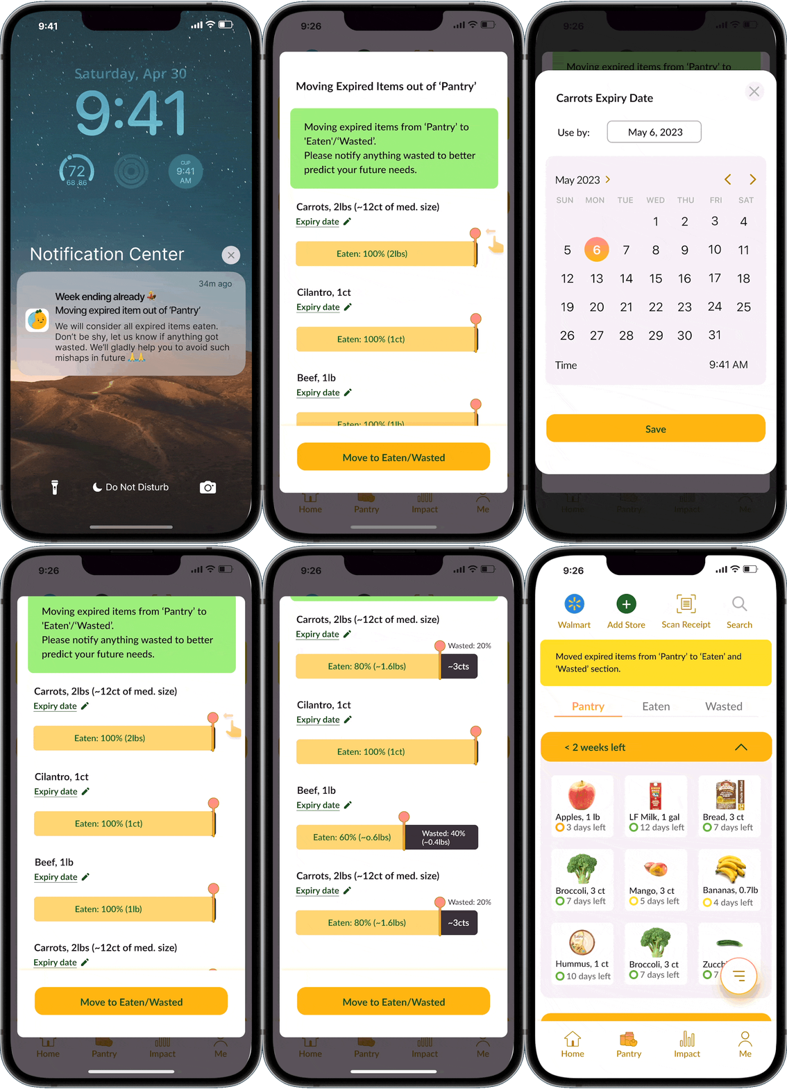
Option B: 1-Click Moving Items from ‘Pantry‘ to ‘Eaten‘ or ’Wasted’
By default, app assumes all expired items are eaten. Incase anything was wasted, users can report by sliding bars.
With single click all expired items can be moved to Eaten/Wasted.
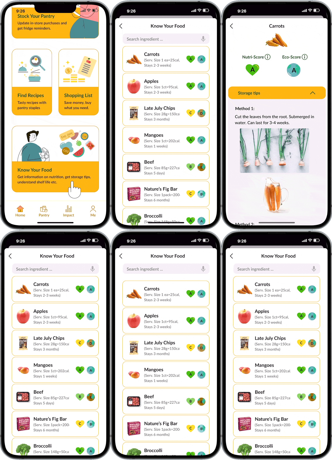
2. Knowing Your Food for Sustainable Choices
Knowing What You
Users can get ‘Storage Tips’ helping them store fresh produce longer.
Users can get info. on ‘When food has gone bad‘ helping them avoid getting misled by expiry dates.
Users can get ‘Nutri-Score‘ - A (Healthiest) to E (Very Unhealthy), helping them eat healthy.
Users can get ‘Eco-Score‘ - A (Eco-Friendly) to E (Very UnFriendly), helping them make sustainable food choices.
App provides this info. for any food item giving users ease of use even if they don’t maintain ‘Pantry’ up-to-date.
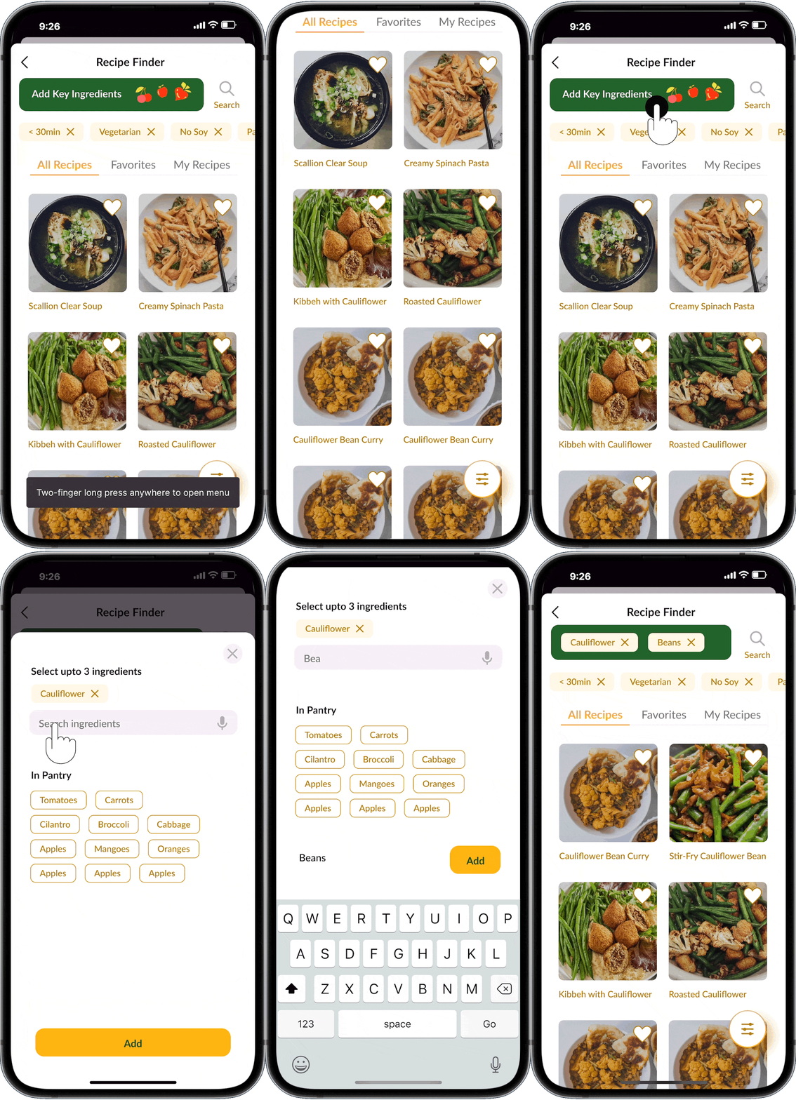
3. Finding Recipes for Relevant Items
Recipe Finder
Users can find recipes with key ingredients.
Users can set other filters like Time, Cuisine, Diet Preferences etc. while searching for recipes.
Users can independently search for recipes even if they don’t maintain ‘Pantry’ up-to-date.
4. Notifications
To create empathy towards food, with suggestive actions and sense of humor (to avoid a nagging vibe.)
(Click to Enlarge)
CHAPTER 5: VISUAL DESIGN
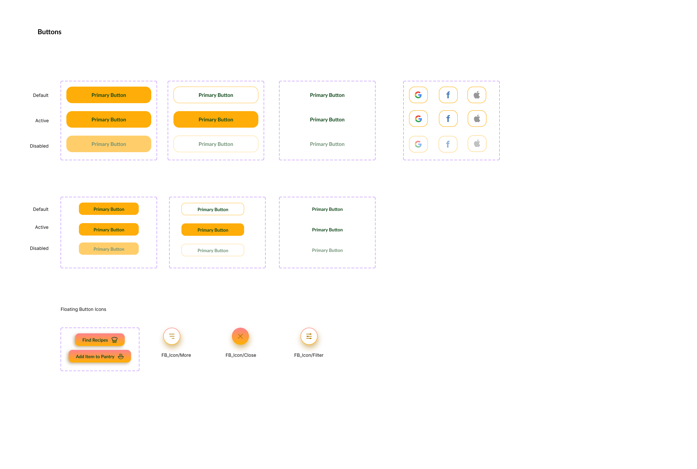
I wanted the app to have a casual friendly vibe and visually echo the message about food and sustainability. With this in mind I created below pattern libraries to appealing user’s visceral & emotional side
Pattern & Component Libraries (Click on the image to enlarge)
CHAPTER 6: IMPACT
Design Success: On user testing the Hi-Fidelity Mockups with 7 users (30-40yrs age range), I found,
76/100
System Usability Scale (SUS) score
Indicating app falls in ‘Good‘ range on the scale from (worst → poor → ok → good → excellent)
85.7% users find the app consistent, well-integrated, easy to use.
67%↑
Increase in user’s willingness to use app daily (3 users → 5 users of 7) by
Simplifying the ‘Pantry‘ flow.
1-Click updates.
Independent user paths to use ‘Recipe Finder‘ and ‘Know Your Food‘ features.
CHAPTER 7: REFLECTION
What I learned ?
1. As user’s were required to do non-routine tasks from usual, a strong sense of purpose become very necessary to keep users motivated.
2. For users who had no time, meal-plan kit was a better solution to reduce food waste.
3. Having pattern libraries helps keep the visual language cohesive, reduces errors and expedites design process with introduction of every new feature.
4. The more the work expected from users, the lesser the chance of user to actually use the app.
PARTING THOUGHTS
Hi! Thank you for scrolling till here🙏.
If I had more time 🤔,
I would like to user test my MVP (minimum viable product) design over a period of 3 weeks with users to understand which features actually create the real impact.
I would design a widget to handle ‘Pantry and Fridge Leftover’ reminders, thereby, making it easy for users to keep Pantry update-to-date and receive the most relevant and useful notifications.
I would also work on applying persuasive design principles like ‘Scarcity’, ‘Authority’, ‘Small Commitments before Big Act‘, ‘Role Modelling bias‘, ‘Hooked Model‘ ethically to change user’s attitude towards food.
I would narrow down specific target user group and accordingly decide the level of persuasive in my app.


